
Project Economics - Component of IHS Harmony Enterprise Software
The Project
IHS Harmony Enterprise has powerful algorithms for hydrocarbon well production and forecasting analysis, but ultimately, operational decisions about oil and gas field assets are financial in nature. Until recently however the software lacked the capability to provide cash flow insights on individual wells and to draw conclusions regarding their profitability.
This diagram outlines the production engineering inputs to well performance, the missing monetary links in the middle, and a range of decisions to make based on the above:

The Opportunity
Functionally sophisticated software for economic analysis does exist, of course - ambitious, performant, and pricey! In large corporations, “pricey” is obviously something for procurement specialists to worry about, not so much end users. Conversations with end users however soon brought to light what’s wrong with that picture, beyond expense.
Organisations rely on production and reservoir engineers to provide authoritative, analysis based recommendations that drive the start-stop-continue decisions outlined by the diagram above at executive or VP level. After all, they’re the ones owning all the technical details. But keep it short and snappy, please!
Using one specialty application for production analysis or forecast, another for financials, and still another to make it all clean, brief and presentable presents a workflow challenge. Not only is this kind of stepping-stone process time consuming to traverse once, it is exponentially more laborious to explore several what-ifs. But exactly those are a hallmark of economic analysis: Minor workover investments per the Enhance end above might keep a well profitable, the alternative being to Stop or Abandon it.
Production and reservoir engineers are not economists. While the feature load of extant economics applications is appropriate for performing the odd ‘deep dive’ on individual assets, it is unhelpful to the broader, more cursory, less precise initial analysis needed to get the big picture on many assets - the forest, not the trees.
The Users
The above is better summarized by the (authentic) quote of one user, rolled into this initial persona study:

My Role and Approach
User centric design practices are not yet well established in parts of IHS Markit’s energy line of business and the fuzzy front end (in terms of requirements articulation and concept development) is often not given enough attention and effort. This project however benefited from an (irregular) opportunity of a front loaded product definition phase. During that time I tag-teamed closely with a usability researcher with a background in the cognitive sciences, and the product owner, herself with a background in petroleum engineering.
We found out soon into the project that the targeted user cohort had begrudgingly accepted the app-hopping status quo described above, and yet struggled to describe where they saw the big gap to their goals - beyond colourful quotes about pinholes and bazookas. User interviews, job shadowing, and contextual inquiry helped outline the problem space but did not shed light on possible ‘vectors’ pointing at a solution. That situation seemed to stem from the participants’ realization that project economics itself is partly foreign territory, with unclear workflows, internal practice standards diverging from one organization to the other and even within organizations, and at times ambiguous expectations from supervisors - all this against a backdrop of lingering aftershocks from the 2015 oil recession.
We therefore pursued an approach of informed conjecture: Exposing participants to interactive stimulus material grounded in the following recurrent observations.
Key Insights and Takeaways from Initial User Engagement
Some critical themes were that decision makers are usually…
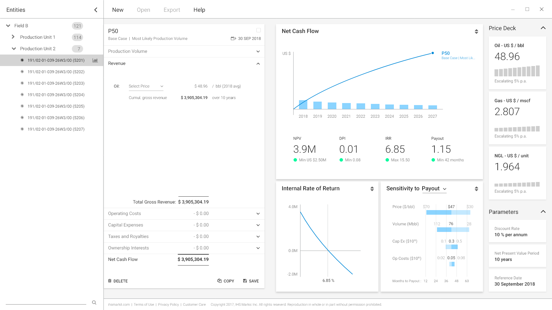
Versed in interpreting cash flows per time unit and on a cumulative basis, in relation to targeted payout thresholds
Relying on key performance indicators (KPIs) to assess, rank, and rate different assets, such as net present value (NVP, more appropriate for large organizations with healthy funding margins), and internal rate of return (IRR, more useful to those in a, let’s just say, nervous investment capital situation), and others
Interested in determining projects’ sensitivity to certain factors - though this was a distant third consideration for most.

To make matters interesting, these - and more - are all moving targets! The concept of NPV centres on the timed value of money based on a discount rate. IRR reverses that notion (of sorts) by manipulating the discount rate to a value where NPV theoretically becomes zero. Market prices for oil, gas, and condensates have long-term trends prone to disruption. Fiscal regime items and inflation-prone fixed and variable costs take a share of revenue. Lastly, a well’s exploitable reserves decline in quasi asymptotic fashion over time - trending toward a zero point that is never reached because the cost of further exploitation becomes prohibitive beforehand.
All these inputs to our Gordian knot centre on time, and this gets us to the crux of the matter. Virtually all competitor offerings we had exposure to leave money on the table when it comes to expressing the time relationship of critical indicators in an audience consumable fashion, factoring in decision overload and limited attention span. Such omissions result in data tsunamis that require many users to make presentable using Microsoft Excel data graphing functions pasted into a PowerPoint or Keynote presentation deck.

Concept Vetting through Prototype Stimuli
I synthesized key drivers into an interactive wireframe deck built with Adobe Xd, which we had internal stakeholders and customer-side users evaluate:
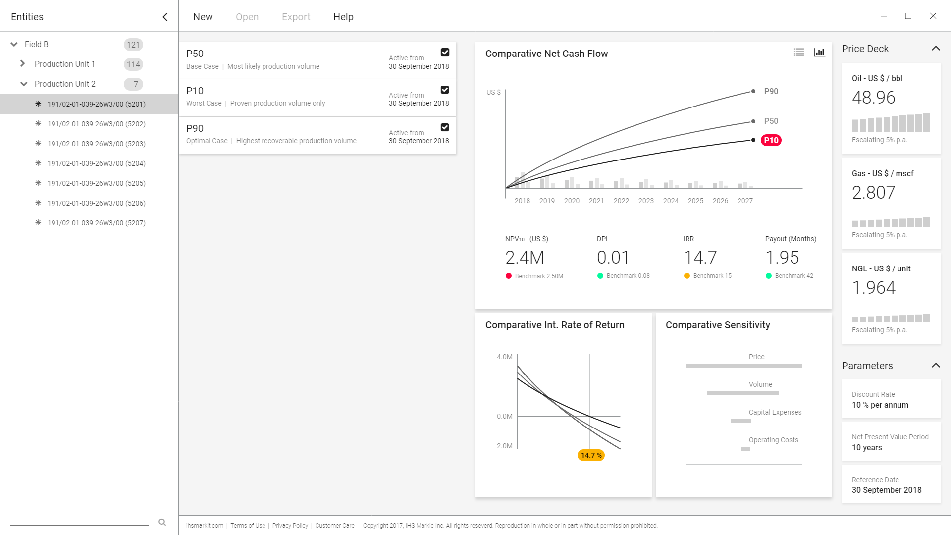
Allow multiple what-if cases attached to the same asset
Copy/duplicate functions to facilitate manipulation of individual parameters, all others remaining equal
Heavy focus on data and KPI visualization that expresses the factor of time and allows case comparison
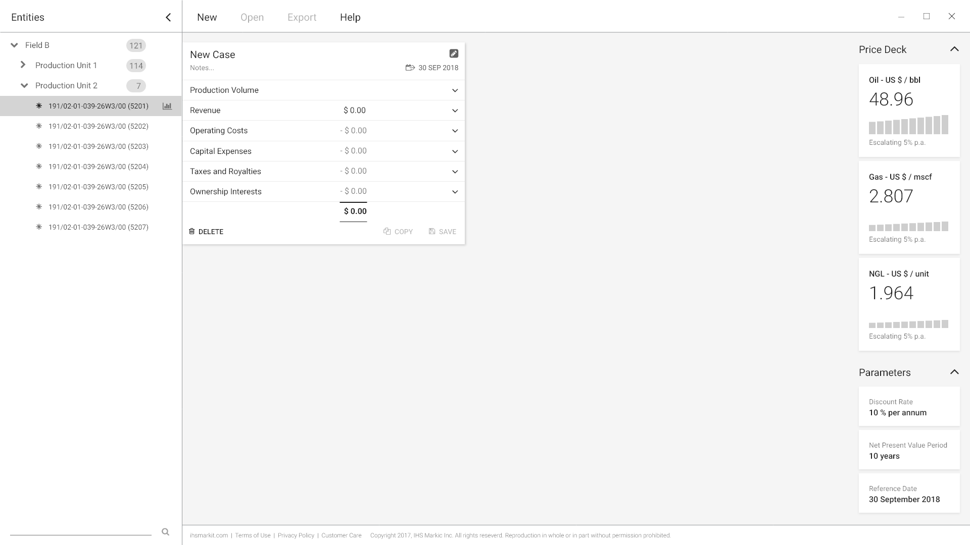
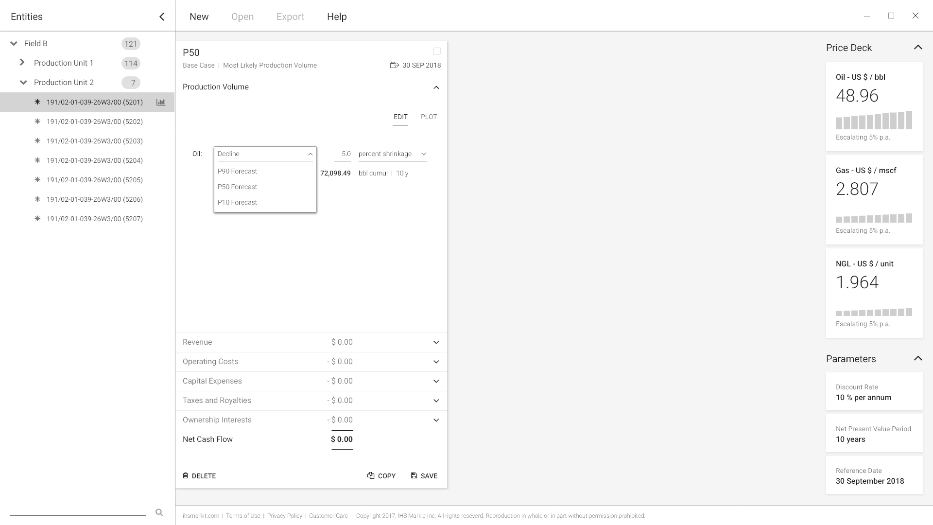
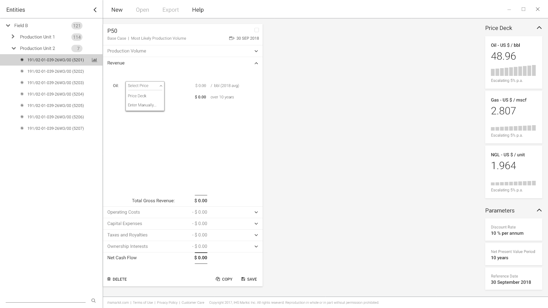
Clean information architecture through thematic grouping of inputs in a dense, compact fashion using an accordion control with expanding drawers
One-stop-shop workflow: As soon as you enter parameters, you see work done. At a level of completion deemed fit by you (the user), content is readily presentable.
An important emotional component, implicit in the decision making situation users describe: Learnable control navigation with instant results display allow the presenter to react nimbly and authoritatively to unexpected questions in the ‘Shark Tank’ situation of an executive boardroom meeting. We’ve all been there!
Feedback to Stimuli
Overall navigation: All users tested readily understood the accordion structure and knew how to interpret the cash flow, IRR, and sensitivity graphs, and found it cleanly presented.
Verbal semantics: ‘Production Volume’ (see above) has a meaning quite distinct from ‘Forecast’ in production engineering; the former implying past, the latter, future quantities.
Visual semantics: Despite consistent icon-verb pairings, the delete, copy, and save controls were not immediately understood as buttons, an interesting takeaway on a cohort with tight age ranges (early 30s to early 40s).
Technology
Project Economics was originally meant as a web based component, which explains the look and feel of the earlier stimulus wireframes. Implementation estimates had the business opt for direct integration into the existing PC desktop software using the Windows Presentation Foundation (WPF) development kit. Data plots were built via WPF integrated SciChart.

Added Feature: Case Management
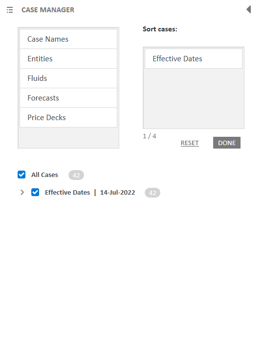
The ability to branch out into several what-if cases, but also to review cases attached to several wells (‘entities’ of a database) contrastively called for a case management feature.
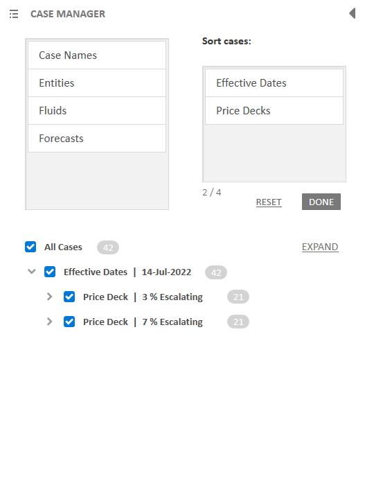
Build a sorting hierarchy by dragging and dropping up to 4 of 6 available categories into the receptacle. The order from top to bottom translates into parent-child-grandchild relationships among the case stack of the selected database ‘entities’ (heavily IT-centric legacy terminology), i.e. wells. In the hypothetical example below, half a dozen cases appended to just seven wells can result in a barely manageable portion of spaghetti on the plot. The case manager will help our users keep control!
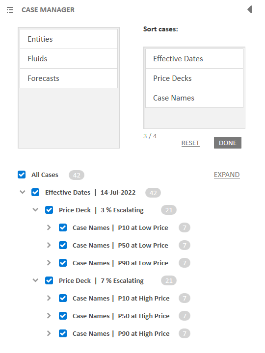
The intended sorting order here is effective date first, price deck second, and case names third. The user could drop one more label, but let’s call it quits here.
The case deck is now re-ordered. A breadcrumb style prefix with retract/expand toggle reflects the sorting order of each block of cases (now seven).
The cash flows plot remains in view, albeit narrowed to the rightmost pane in the viewport frame.
Individual case representation on the plot can be toggled on or off (filled vs outlined circle). In this example, all cases are on to illustrate the resultant dense graph cloud. While you may not be able to see the forest for the trees, a certain pattern among the 42 (sic) overlapping graphs remains perceptible - as would be any severe outliers to this pattern.
Clicking one case card (or flat tile) emphasizes the associated graph; unlike show/hide, this behaviour is mutually exclusive. One case can have emphasis at a time.
Retract the case management tool curtain style when done. The case stack pane moves left and the plot area expands to take centre stage again.


Added Feature: Price Deck Editor
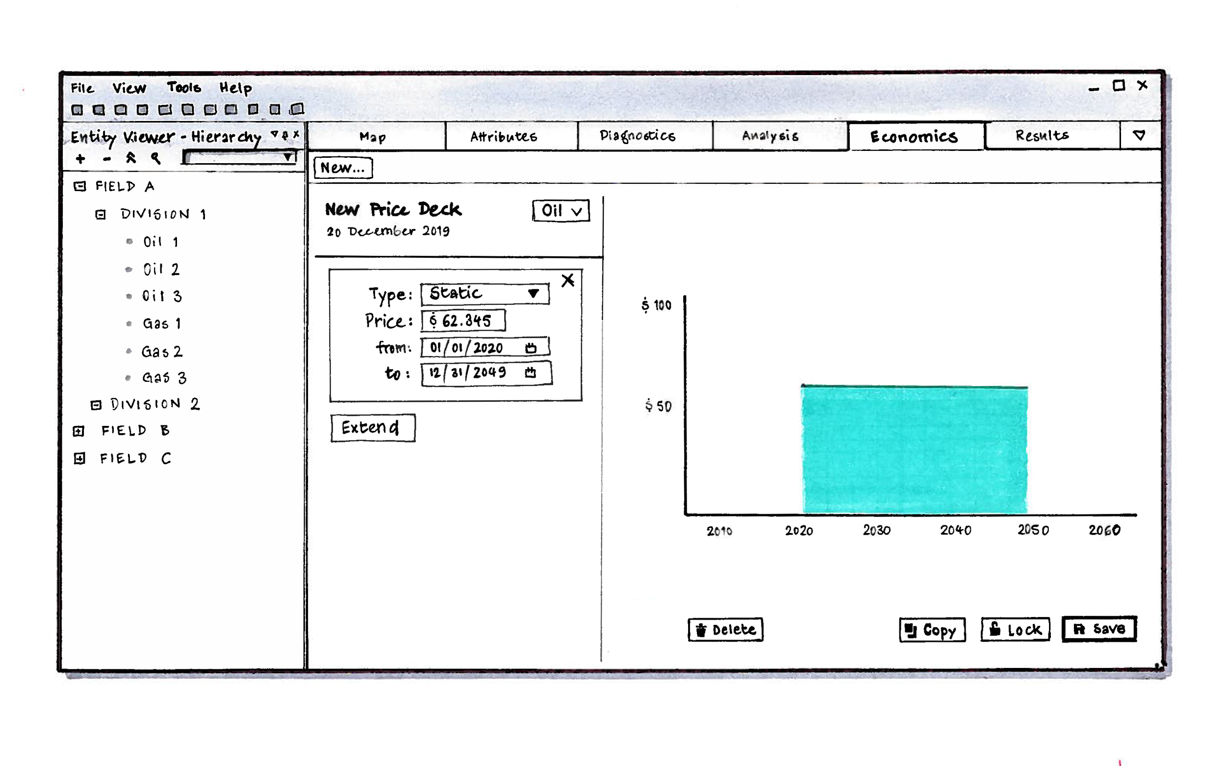
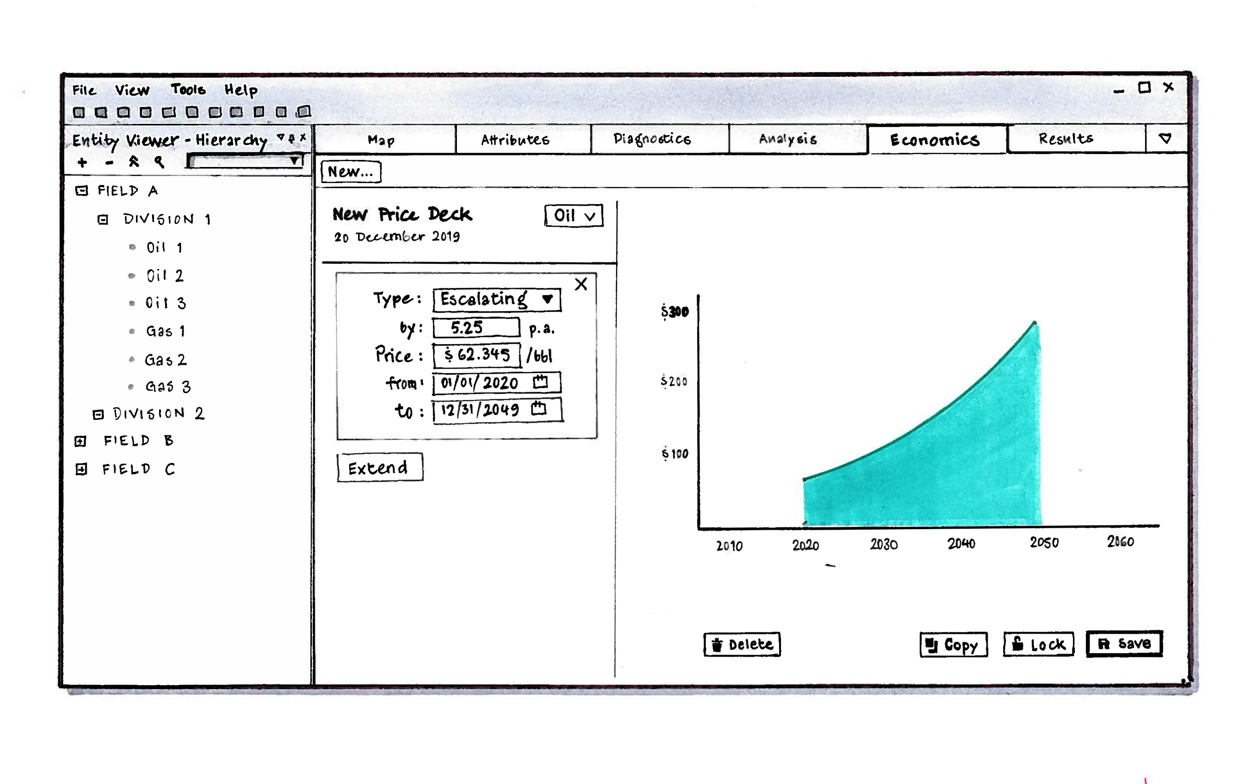
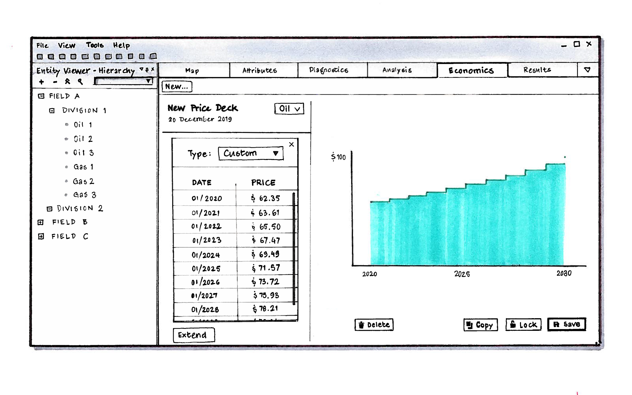
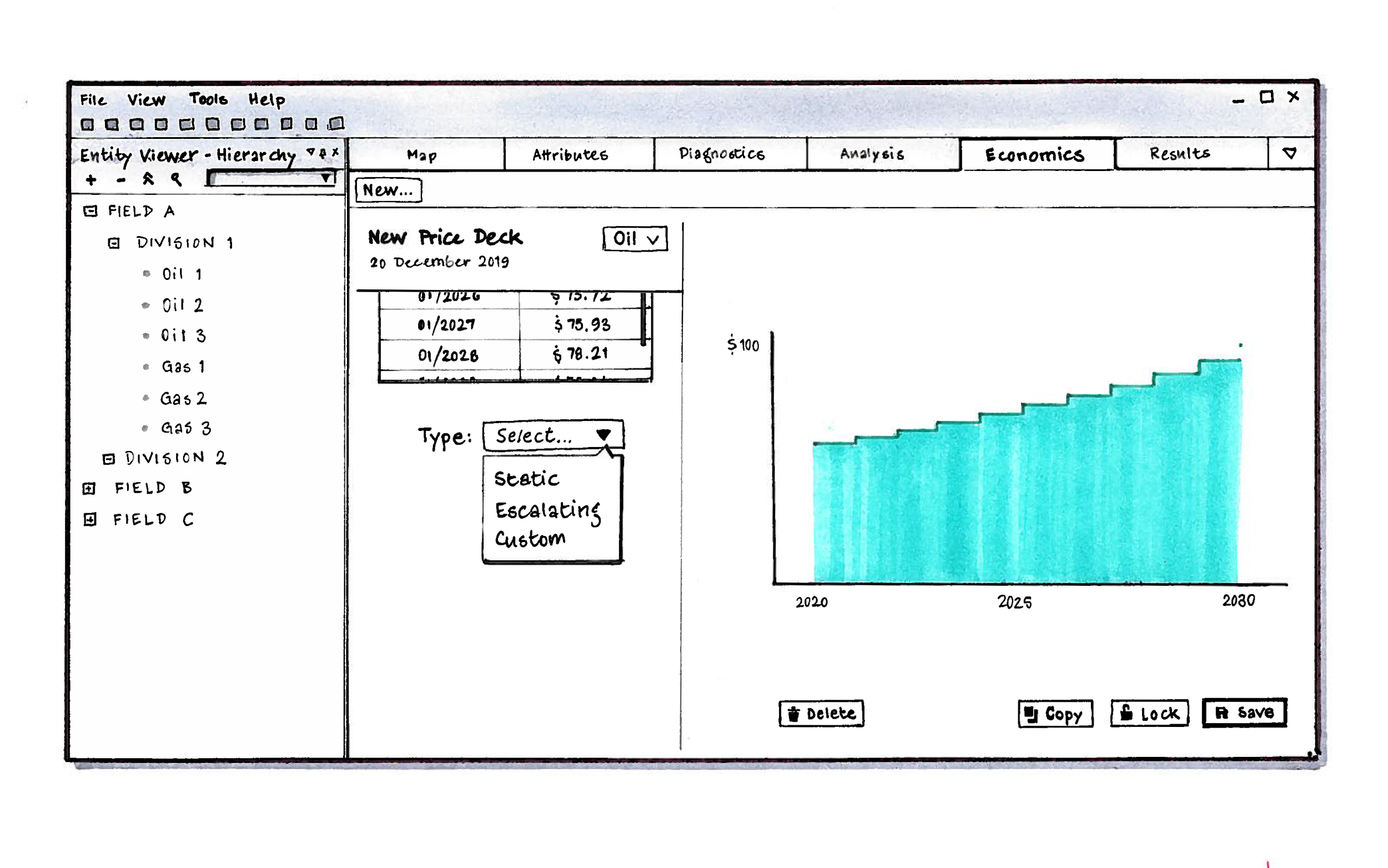
Project Economics was originally intended to support several alternate ‘price decks’ (a jargon term for market trending scenarios of individual resources). I tested a simple paper prototype of the concept grounded on very simple, cursory requirements (for ‘static’, ‘escalating’, and ‘custom’ trending models) for clarity, learnability and overall ease of navigation.
The paper prototype consists of a 30-frame pdf built from simple pen-and-marker sketch fragments, scanned and pasted together in Adobe Photoshop, then provided with page-to-page hyperlinks with Adobe Acrobat. This basic but effective technique suited the situation as all our test participants were remote located. A full click-through takes about 5 minutes.
The following half-dozen pages are a snapshot capture of the essentials of this concept:
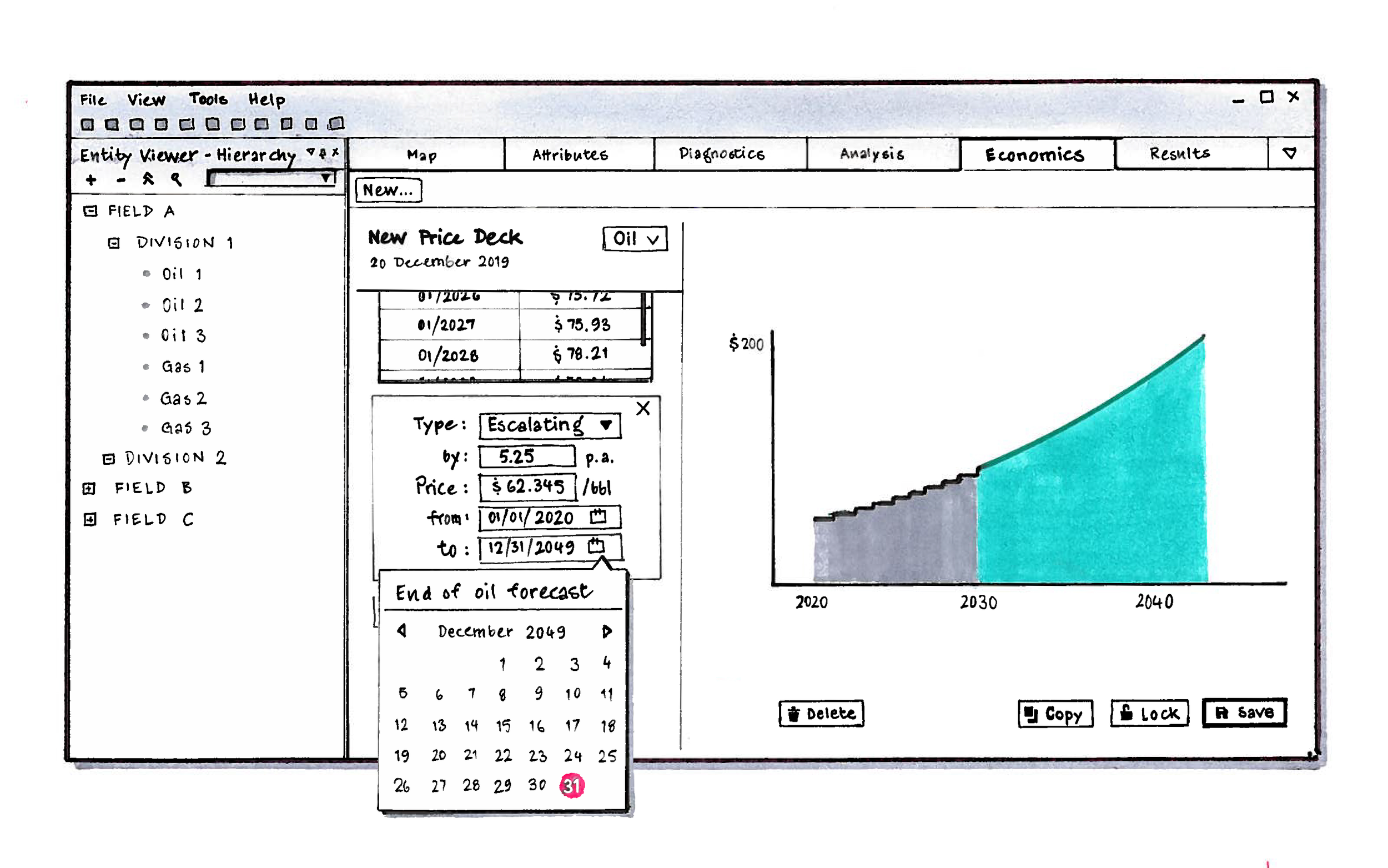
A static price deck implies a flatlined price; unlikely but simple.
An escalating price deck represents a monotonous trend.
A custom price deck allows (A) manual entry of price variability/volatility over time, or (B) pasting price points from an external source, which is what many organizations use.
External price tables typically cover no more than 20 years (if that). To stretch further into an uncertain future, simply concatenate a static or escalating price extension.
The price extension can be set to end at a specific date, or latch onto the end of forecast. The user must choose one or the other.
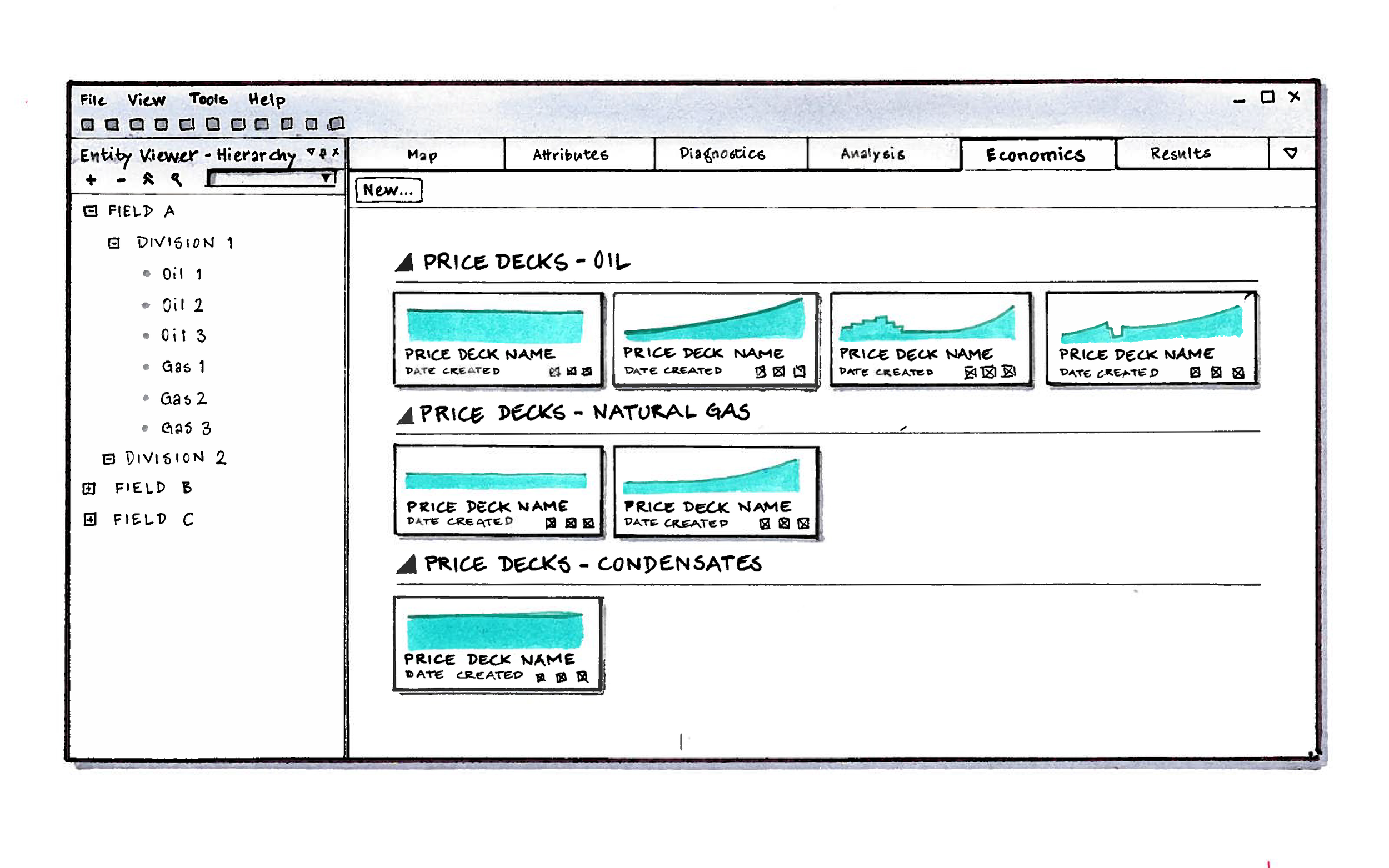
Several alternate price decks can be built for each hydrocarbon asset of interest, and compiled in a library from which to choose later on.